
Research data is sometimes hard to understand. With so much data being processed in a research, data visualization can provide a better way to understand the data. Many data visualization tools are available for researchers to perform a variety of task throughout the research cycle; from exploring literature to publishing articles.
What is Data Visualization?
Data visualization is generally defined as the graphical representation of data and information. By deploying visual elements like charts and graphs, visualization tools provide an easy way to identify trends, patterns and outliers in data. The presentation and visualization of various types of data require thoughtful data management and appropriate use of colours. In this post, we would introduce SCImago Graphica, a new and free tool for analysis, exploration and visualization of data.
What is Scimago Graphica?
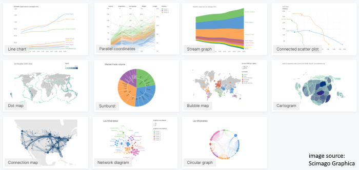
Developed by Scimago Lab, SCImago Graphica is a visualization tool which combines great versatility with the ease of use. It has an intuitive interface, and users can easily explore, filter and visualize a dataset by drag-and-drop, and no coding is required. In addition to simple visualization like bar chart, SCImago Graphica also allows users to create complex and interactive visualization such as bubble plot (Fig. 1), cartogram network diagram, dot map and lots more.
SCImago Graphica is freely available at https://graphica.app/. Try it now!
(Fig.1)
– By Kevin Ho, Library
Hits: 777
Go Back to page Top
- Category:
- Research Tools
Tags: Visualization tool
published December 13, 2021
last modified December 16, 2021