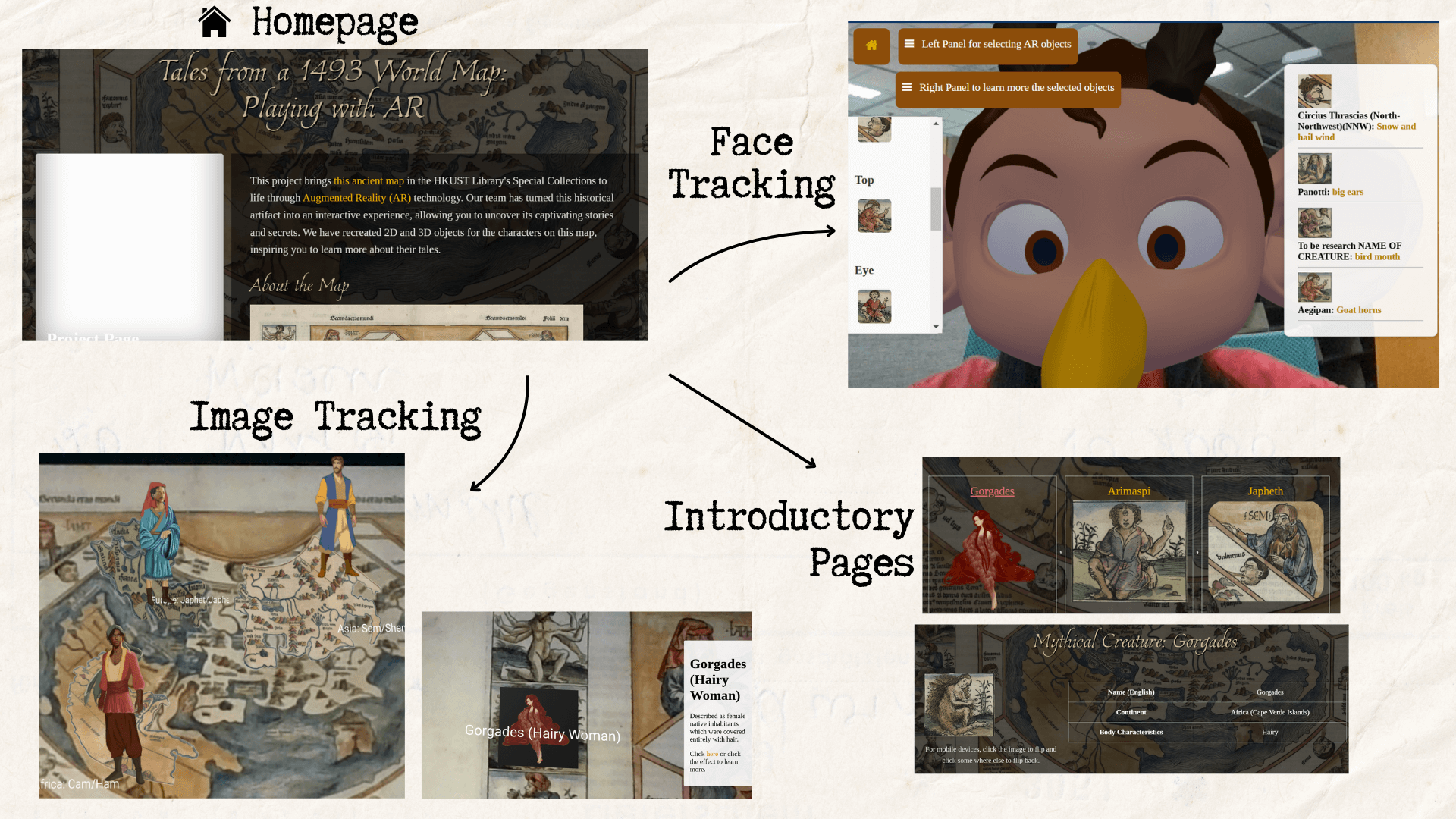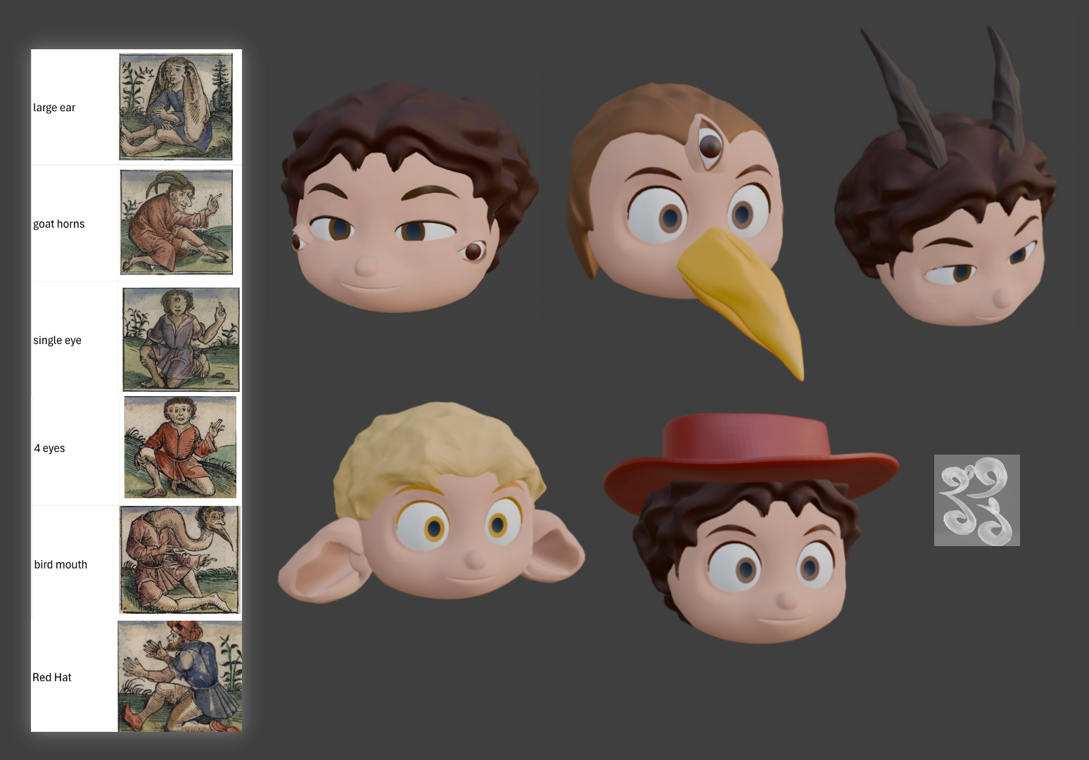


DS Project S001
2023/24 Summer semester (Jul-Aug 2024)
PROJECT BACKGROUND
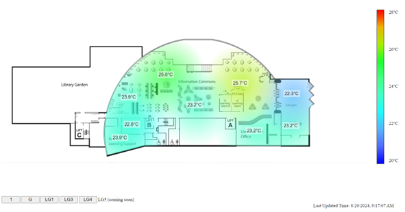
It is often reported that the library is overly cold. It is necessary to have a complete understanding of the temperature distribution in various library sections. The library also listens to feedback from LibQUAL+, a library services quality survey. A heatmap will be useful in providing information about the temperature conditions in different locations. With this, users can find and identify areas that are at their optimal temperature for learning. By helping users to find the most comfortable learning environment, the studying experience of users will be improved.
PROJECT GOAL
The main objective of this project is to construct a heatmap that uses the temperature data collected from sensors positioned throughout the library to illustrate the temperature differences throughout the space.
Methodologies
1. Getting data from API
The Campus Management Office has installed temperature / humidity sensors all over the library for surveillance purposes. The API named “sensor-data” serves as a repository for storing temperature data gathered by the sensors. It allows obtaining temperature readings that will be used in subsequent stages. Temperature information will be dynamically retrieved through an API request, ensuring the heatmap displays the most recent temperature conditions.
2. Recognizing coordinates
To accurately identify each sensor location on the floor plan, a GeoJSON file is needed. The zones that every sensor observes were specified. The area each sensor is monitoring is outlined using QGIS (Quantum Geographic Information System), a geographic information system program. A GeoJSON file of the coordinates of the outlines will be generated.
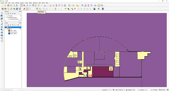
3. Drawing circles
Based on the coordinates of the outlines stored in the GeoJSON file, the centroid of each area is being computed. It is the centre of drawing circles on the heatmap. Every circle denotes a particular region that a sensor is monitoring. The colour bar serves as the basis for determining the colour of each circle according to the temperature.
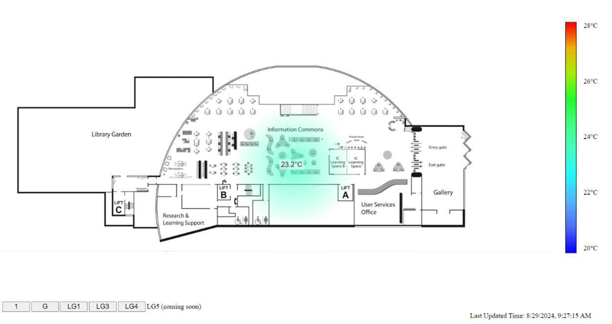
Checkout the visualization!
Library Temperature Heatmap (Beta): https://lbapps.hkust.edu.hk/heatmap/index.html.
Backstage stories
LOU Cheuk Yin, Jessie
...The project has not only advanced my technical skills but also honed my problem-solving techniques and user-centric design thinking. Overall, this endeavor has equipped me with practical knowledge in geographical analysis, API integration, and data visualization. The user-focused solution design also emphasizes the importance of creating impactful and user-friendly visualizations for real-world applications…
”
PROJECT Team
Developer
- LOU Cheuk Yin, Jessie ◇ Year 3 student, BSc in Data Science and Technology
Adviser
- Terry YIP ◇ Librarian (Systems & Digital Services)
Source code
Check out our GitHub repository here: https://github.com/hkust-lib-ds/S001-PUBLIC_LibFloorPlan-Temperature-Vis.
If you have any questions or find it helpful, we’d love to hear your thoughts and see your projects too. Feel free to reach out and share with us !