Challenges and Obstacles
Originally, I intended to use Python libraries for my project, but I encountered few obstacles that impeded my progress. One major challenge was the difficulty in locating coordinates with accuracy. This failure led me to look for alternative solutions. With the help of a library colleague, I eventually discovered “heatmap.js“, a library that effectively aligned with the project requirement. As a result, I decided to switch from Python to JavaScript.
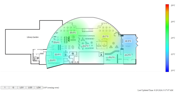
I was inspired to create heatmap by the way “heatmap.js” rendered circles, changing colour based on how far out they were from the center. Although this method improved the heatmap’s aesthetic appeal, it posed limitation in precisely representing different temperatures within the library. This insight made me reevaluate the direct implementation of “heatmap.js” because it sacrificed accuracy for beauty. Nevertheless, a novel idea was inspired by the notion of altering circular opacity only according to distance from the center, which was taken from “heatmap.js”. By maintaining a consistent colour scheme while gradually decreasing opacity as distance increases, both visual impact and data accuracy were improved in my heatmap visualization.
What I have learned
Embarking on this project journey has been a great way for me to learn and has improved my skills in visualization. The difficulties I ran across, like the inaccuracies in obtaining coordinates due to Python libraries, encouraged me to look into other approaches that might have been more appropriate for the task. This change emphasized the value of flexibility and investigating various approaches in the software development process. I have learned spatial data handling as I used GeoJSON files to map sensor positions on the floor plan. My understanding of data representation and visualization concepts was furthered by examining the relationship between temperature measurements and colour gradients, which highlighted the critical role that colour plays in effectively expressing complex information. Reflecting on my use of “heatmap.js”, I realized that the colour gradient in the circles and the colour bar that represented the various temperatures might not have provided users with accurate information. This acted as a moving reminder to be mindful of accuracy while presenting data during visualization.
My grasp of data visualization has expanded as a result of working on this project. It gives me invaluable practical experience.
Conclusion
The project has not only advanced my technical skills but also honed my problem-solving techniques and user-centric design thinking. Overall, this endeavor has equipped me with practical knowledge in geographical analysis, API integration, and data visualization. The user-focused solution design also emphasizes the importance of creating impactful and user-friendly visualizations for real-world applications. I believe the knowledge I have gained will be beneficial to my professional development and personal growth.


