Background
The Library started planning for the Learning Space Enhancement Project in late 2013, with the aim to refurbish some Library space following the style of the Learning Commons, which has been very popular since it opened in 2012. Knowing users’ needs and perspectives is an important part of our planning process. In March 2014, we conducted these Learning Space Design Workshops with students, in order to solicit fresh ideas from them.
These interactive workshops gave students free hands to design learning space using the existing Library floorplans of 1/F and LG1, where the Library was targeting to refurbish. Participants were first invited to brainstorm about their learning needs through drawing mindmaps and making priority lists. Then they were given some background information about the Space Enhancement Project, and the Library floorplans to do their design in groups.
Totally three sessions were conducted, each session lasted 1.5 hours. About 35 students attended the workshops. It was a lively and fun experience.
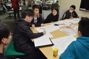
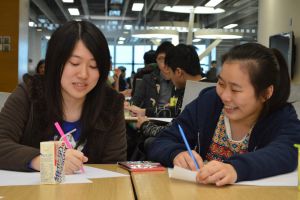
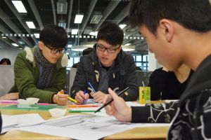
Participants’ Ideas
Mindmapping Students’ Life
To prepare the participants to think about their learning space, they were first guided to map their student life using free association. They produced quite a few interesting mindmaps.
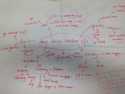
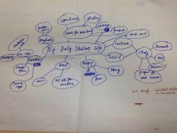
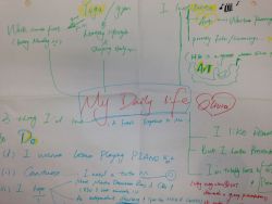
Their maps was summed up by this word cloud:

Students’ Suggestions for Learning Space
The participants were asked to list and prioritize desirable features of learning space in the Library:
These were most frequently raised, usually with high priority
- More study space and seats, especially single seats
- More study rooms
- Access to food and drinks
- More power sockets
- Relaxing, creative space
These were raised a few times, and often got pushed down after prioritization
- Add plants, artworks, colors
- Better privacy in study rooms – soundproofing, non-transparent design
- Using ITSC print mechanism
- Add more scanners and printers to other floors
- More textbook copies, more new versions
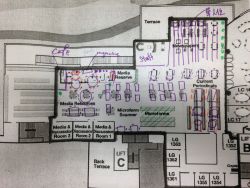
Students’ Designs
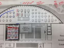
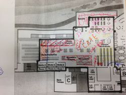
We collected a total of 11 designs. Some major themes emerged:
Refreshment area: A number of groups used half of one floor, either 1/F or LG1, as a refreshment area. Their designs ranged from copying the current Refreshment Zone idea (sofa, snack machines, water fountains) to a full-scale café (with catering, background music, like a bookstore café)
Attempt to maximize seat capacity: Some designs have rows of single-seat study carrels to increase the number of seats in the space. A few included very long tables to increase number of seats. Some of these ideas were purely motivated by making more seats; some were for compensating the loss of seats due to their “café” idea.
Single seats: This seems to be a recurrent element in a number of designs.
Media and Discussion Rooms: Not every group thought of redesigning the rooms. Only 1 group suggested moving media staff into one or two of these rooms; another suggested moving the function of the viewing carrels into these rooms.
Table size: Apart from the “long table” idea to squeeze more bodies in the plan, some groups thought individual tables (e.g. 4-seats) are the most useful.
Water fountains: A few designs added water fountains in different areas.
Use of plants: Many groups used plants to separate noisy/relaxing areas and study areas.
Library’s Actions
Students’ ideas and priorities were summarized and given to the interior designer of the Learning Space Enhancement Project. Subsequently, much of the 1/F and LG1 space was retrofitted with new furniture by 2015 Spring Term.
The Library attempted to adopt students’ suggestions within the constraints of available physical space and project budget. As a result, the Theses Room on 1/F was upgraded to be a deep quiet study space; and more individual study space was added to LG1. Staff space on LG1 was also consolidated and relocated to free up space for students’ learning. Nevertheless, not all the features desired by students could be realized. For instance, although a number of workshop participants suggested more café-style areas, the Library simply has no space that is appropriate to meet such need.
Go Back to page Toplast modified 03 October 2016

