


Website Revamp Timeline
The current Library website is now eight years old. Library staff are in the process of revamp it to improve user experience and to support the HKUST community’s learning, research, and navigation workflow.
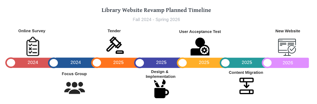
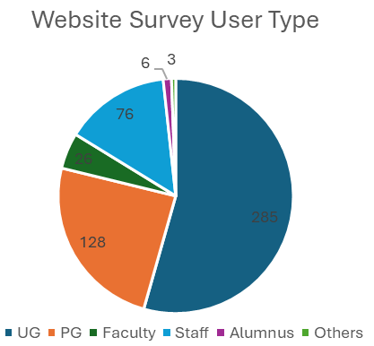
Online Survey – September 2024
524 responses were collected: 285 UGs, 128 PGs, 26 Faculty, 76 Staff, 6 Alumnus, 3 Others.
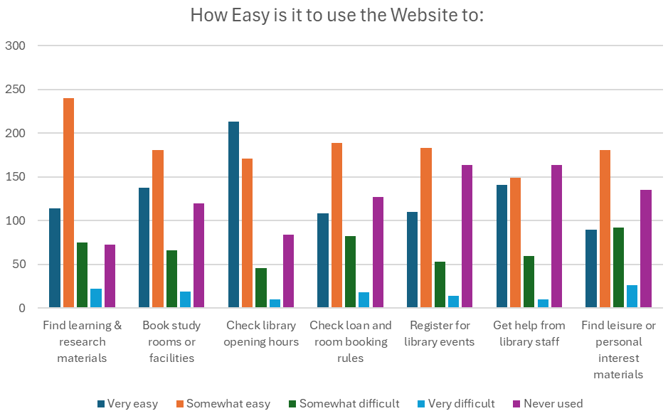
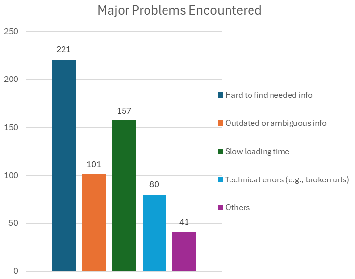
Results are summarized into three categories.
Website usability:
Most users found the website relatively easy to navigate, However, they found some tasks like checking rules and policies and finding leisure materials more challenging. 19% of users identified the dropdown menu as an area of difficulty.
Desired enhancements:
- Streamline the website navigation
- More vibrant color scheme and energetic appearance
- Optimize visibility of latest acquisitions and important resources
- Improve room booking User Interface (UI)
Desired new features:
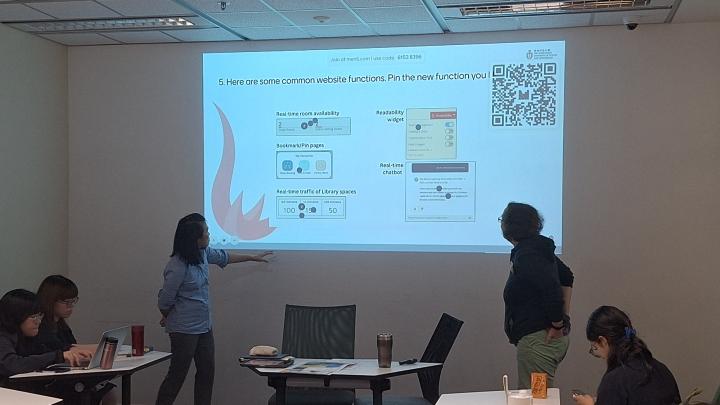
- Real-time chat support
- Personalization features such as bookmarks for frequent searches, personalized collections
Examples of what people listed under “Others”
- Requires prior understanding of some of the terms (related to the navigation menu)
- Not mobile friendly
- Room booking UI is terrible
- Too many items on the menu
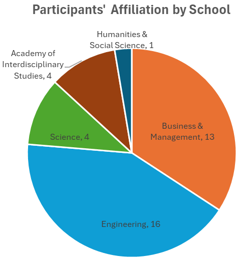
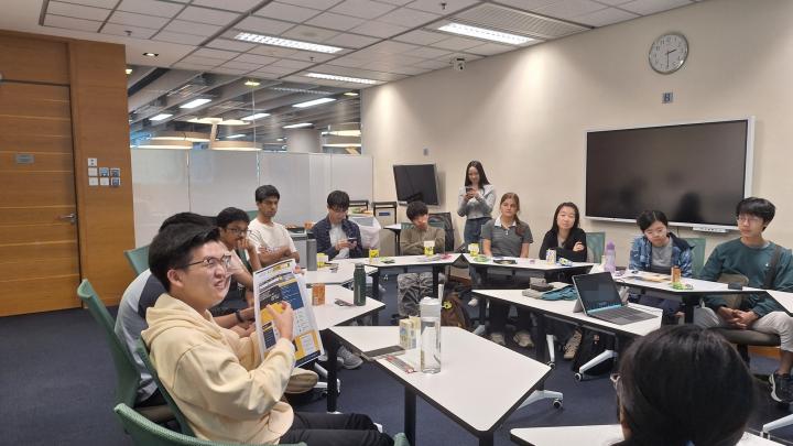
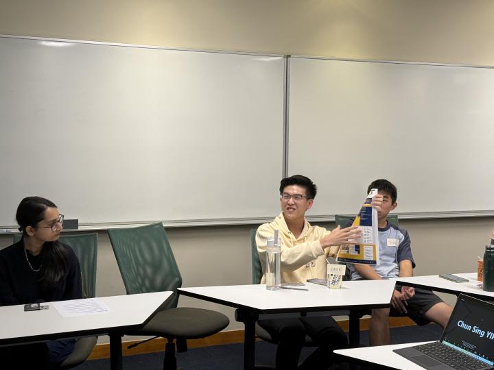
Face-to-Face Focus Group Meetings - November 2024
We organized 3 focus group sessions to follow up on issues from the online survey. 38 people joined (30 UGs & 8 PGs).
Before the meeting, participants were given 5 Library websites to review and vote for their favorite.
During the meeting, verbal questions and online polls (mentimeter) were adopted to prompt participants to share their comments on the design of the current Library website, their experiences in using the website, and their expectations on the future revamped website.
Key Insights from Focus Group Meetings:
- As participants often search Google for library resources, enhancing our website’s SEO would improve discoverability.
- There were also suggestions to merge PowerSearch and site search.
- There are mismatches in terminology and categorization between Library staff and participants in the drop-down menu; particularly regarding the distinction between “Services” and “Help For”. This confusion highlights the need for a user acceptance test to ensure the successful implementation of the new website.
- Look and feel of the website: Participants noted that the homepage was overwhelming and cluttered, describing it as information-heavy with excessive details and numerous buttons crowding the interface.
- Visual Enhancements: Incorporating arrows, icons, and more distinct colors to improve the dropdown menu’s visual appeal and usability.
- Contrasting opinions regarding the elements of the homepage that users like or dislike.
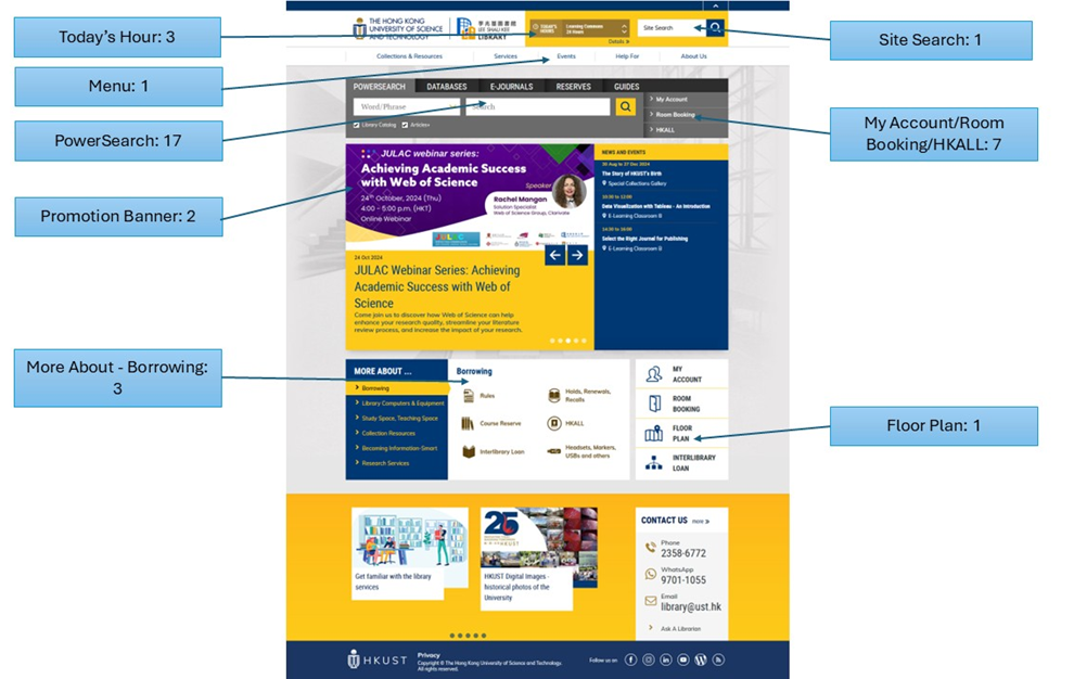
*Area of Website Participants Liked Most
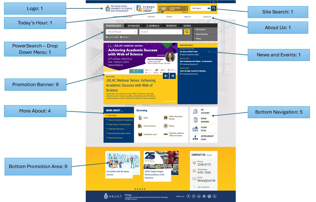
*Area of Website Participants Disliked Most or Suggested for Removal
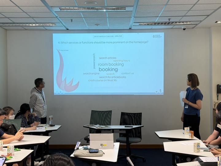
Functions/services that should be more prominent
- Room booking (18/38)
- PowerSearch (12/38)
- Site search (7/38)
Most desired new functions
- Real time occupancy of Library spaces (20/38)
- Real time room availability (7/38)
- Real time chatbot (6/38)
Going Forward into the Design & Implementation
Based on the results from the online survey and focus group discussions, we will incorporate user preferences into the design of the new website by focusing on the following criteria:
- Mobile-friendly interface.
- Enhanced site search capabilities
- Real-time updates for space occupancy, study room availability, and chatbot support.
- A cleaner, more intuitive layout to minimize information overload
- Re-categorized and clearly labeled categories for services, resources, and facilities.
- Simplified dropdown and navigation menus.
- Increased visibility for popular and essential services/resources.
