Knowing course prerequisite is important for students to plan their study path. With a clear visual representation, navigating course pathways becomes easier, allowing students to plan their academic journey more effectively.
With the beginning of the new semester, today let’s explore how Python can be used to map out course prerequisite networks, providing both static and interactive visualizations that can aid in course planning.
To achieve this, we’ll demonstrate two methods: using NetworkX for static visualizations and ipysigma for interactive ones. Both tools help visualize networks, but each serves different purposes depending on the complexity and scale of the data.

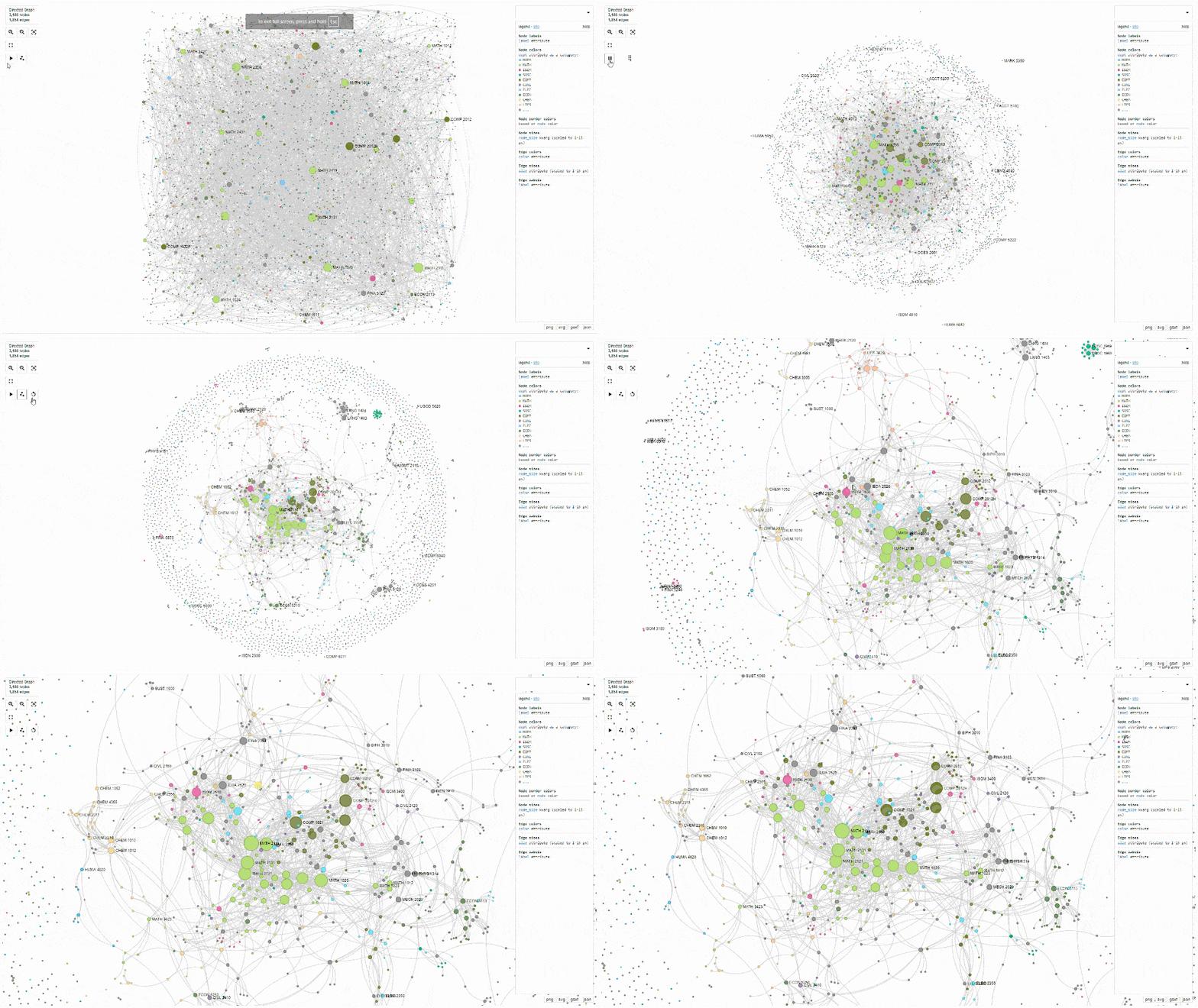
Course prerequisites network visualization made with ipysigma
Use Case: Course-Prerequisite Networks
In this example, we’ll visualize the course prerequisite network for undergraduate and postgraduate at HKUST for the 2024-25 academic year.
Installing Packages
To get started, we need to install the necessary libraries using pip:
| !pip install pandas !pip install networkx !pip install matplotlib !pip install ipysigma |
Creating the Data
We start by creating a simple DataFrame to represent courses and their prerequisites.
| import pandas as pd
# Define the data # Create a DataFrame # Display the DataFrame |

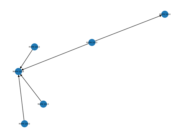
A simplified DataFrame to represent courses and their prerequisites
Creating the Graph with NetworkX
Using this DataFrame, we can create a directed graph in NetworkX. This involves adding nodes to represent the courses and edges to represent the course prerequisites.
| import networkx as nx
# Initialize a directed graph # Add nodes and edges from the dataframe # Add edges for prerequisites # Draw the static network |

Visual representation of the simplified DataFrame by NetworkX
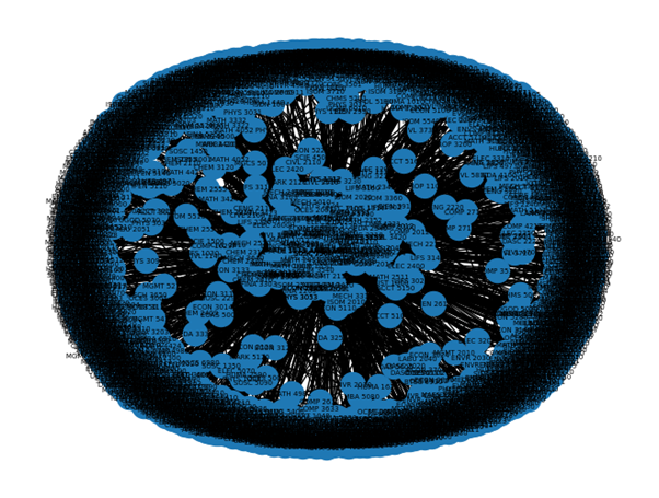
While NetworkX helps create a structured visual representation of the network, static graphs can become difficult to interpret when dealing with large datasets. For example, when we load 3,000+ course records, the graph becomes difficult to interpret, requiring further customization.

Visual representation of course prerequisites with NetworkX
Additionally, the static layout of the NetworkX visualization makes it challenging to interactively explore and analyze the network.
Enhancing with ipysigma
To address the limitations of static graphs, we can use ipysigma to create interactive visualizations that allow for dynamic exploration of the network. Instead of using the “draw” function in NetworkX, we use ipysigma’s Sigma function to generate an interactive widget.
| From ipysigma import Sigma
# Create an ipysigma widget # Display the widget in the notebook |
One of ipysigma’s key advantages is the ability to export the graph as an HTML file, making it easy to share interactive visualizations with others.
| # Export the graph to an HTML file sigma.write_html(G, ‘./sigma.html’, fullscreen=True) |
Customizing with ipysigma
ipysigma also offers extensive customization options, allowing adjustments to the layout and appearance of the graph (updated html). You can control variables like node color, size, and edge types to make the visualization more informative. For more details, you can refer to the available visual variables in PyPi.
| import ipysigma
# Export the graph to an HTML file |
Remarks
By mapping course prerequisite networks, we can help students and academic advisors visualize the relationships between courses. While NetworkX is a powerful tool for creating these visualizations, its static nature may limit its effectiveness for complex datasets. ipysigma enhances this process by enabling interactive exploration, making it easier to navigate and understand large networks. This makes ipysigma a valuable addition to your toolkit when working with network data in an educational context.
All the code and the course prerequisite dataset can be found and run on Google Colab.
– By Ernest Lam, HKUST
Views: 866
Go Back to page Top
- Category:
- Research Tools
Tags: course planning, course prerequisites, interactive graphs, ipysigma, network visualization, NetworkX, python
published September 4, 2024


