
Beamplot is a new tool that presents citation impact. It shows a richer picture of one’s publication portfolio than single-point metrics such as citation counts and h-index. This post takes 4 HKUST professors as examples to explore beamplots.
Problems with single-point impact measurement, e.g. h-index
Researchers’ achievement is often evaluated by how many times their publications are cited or h-index. For example, an author with an h-index of 10 has 10 publications that are cited at least 10 times. However, capturing one’s citation impact into a single number inevitably oversimplify things. Two individuals may have the same h-index but may have very different contributions in scholarship. One’s h-index can only go up, even if a researcher stop publishing anything new. Senior researchers often have more publications than early-career researchers, therefore they have higher h-index irrespective of the quality of their work. The measure can also be boosted by self-citations; and, it does not reflect the different citation behaviors in different disciplines.
This recent article compares Einstein’s h-index with that of a controversial scientist Didier Raoult; it illustrates the issues well.
Author Impact Beamplots
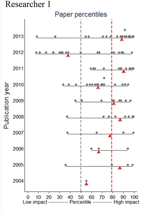
Fig. 1: From: Plots for visualizing paper impact and journal impact of single researchers in a single graph (Bonnmann and Haunschild, 2018)
The idea of using beamplots to visualize an author’s bibliometric data was developed by Bornmann, Marx and Haunschild in the Max Planck Institute (2014a, 2014b, 2018). It plots normalized citation counts of an author’s publications across years, hence showing change of citation impact through a researcher’s career.
Fig. 1 shows a sample beamplot. Each dot represents a publication, the position is determined by the field-normalized citation percentile (x-axis) and publication year (y-axis). The red triangles mark the median percentile of the papers over a publication year. In addition, the red dashed vertical line marks the median percentiles for all the years.
In this example, we can see Researcher 1 became increasingly productive over her career (there are more and more dots as years go by). She also has a high overall impact in her field (the red line is at 80, way above the average mark of 50). However, her citation impact varies somewhat across her career (you see the red triangles jump left and right of the dotted line; and the grey dots spread out widely horizontally).
How to Make a Beamplot
At the time of this post, the easiest way to find beamplots of researchers is through the database Web of Science. You can find them in the Author Record page, see these examples: Prof. CT Chan; Prof. Nancy Ip.
To explore what beamplots can tell us, let us look at the plots of 4 HKUST professors:
| Professor | Discipline | h-index (WoS) | Number of publications in WoS | Number of publications in HKUST SPD * | Total times cited (WoS) |
|---|---|---|---|---|---|
| A | Physical science | 16 | 34 | 60 | 1702 |
| B | Life science | 14 | 24 | 20 | 5028 |
| C | Engineering | 31 | 115 | 254 | 2738 |
| D | Social Science | 7 | 18 | 58 | 371 |
* Since WoS does not have all papers by an author, the number of journal articles and conference papers in SPD is included as a reference indicator of the author’s output volume.
From the table, you can already see that you cannot simply use h-index to judge a researcher’s impact. Prof. B has a lower h-index than A and C, but her total time-cited is way more than the others. Prof. C looks like a high performance researcher, but what does it means behind these numbers? Prof D looks weak in output, is this the case? Let us look at the beamplots (Fig. 2 to 5). You can click to see a bigger image.

Fig. 2: Prof. A

Fig. 3: Prof. B

Fig. 4: Prof. C
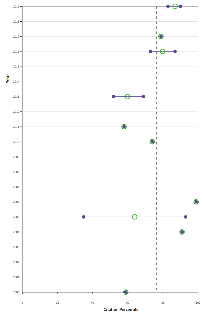
Fig. 5: Prof. D
The Web of Science beamplots have the same elements as the sample in Fig. 1, although the symbols are different. Each paper is a purple dot; the yearly median impact is a green circle, while the overall average impact is still a vertical dotted line.
From these plots, we can observe quite a few details, for example:
- All 4 professors have higher than average impact in their fields (the vertical dotted lines are all considerably higher than 50, the average).
- Prof. A produced a few highly impactful works earlier in her career. From 2009 onwards, she had more publications (more purple dots) yet the average impact seemed to have dropped (green circles more on the left)
- Prof. B and C are both young researchers (publishing started around 2010) and highly impactful (the vertical lines are around 90%), although their h-indices are very different. Prof. C is very productive (lots of purple dots)
- The case of Prof. D demonstrates that WoS data is often too weak to show a good picture in some disciplines, in particular social sciences and humanities. Because WoS only captured 18 of Prof. D’s publications, the plot looks sparse. In fact, according to SPD, Prof. D has close to 60 papers, and many books and book chapters. Yet, with the limited data, the plot still shows that Prof. D’s average impact is above average, and it highlights the impactful works (those dots on the right end).
Summary and Notes of Caution
Beamplot is better than a single-point metric for evaluating researchers’ performance, because it uses field-normalized counts, and reveals impact over time. Citation counts are normalized into percentile in their own disciplines. It is more meaningful to see relative impact among the papers in the same field, rather than using the absolute counts. It can be a useful tool to show overall performance, and at the same time highlight outlier publications as well as change of impact through one’s career. Yet, it is merely a tool; it should help inform rather than determine performance assessment.
By design, beamplots do not analyze papers of the most recent two years. It takes time for citations to appear; there is therefore not enough data to make meaningful benchmarking. As a result of this practice, new researchers cannot see their publication record in a beamplot.
We should also note that the data quality determines the reliability of the plots. The beamplots in WoS are based on citation counts and citation percentile in their own databases. As we see in the examples, their databases have varied coverage across disciplines. We should be aware of these limitations when viewing the charts.
— By Gabi Wong, Library
Views: 980
Go Back to page Top
- Category:
- Evaluation and Ranking
Tags: beamplot, h-index, web of science
published October 14, 2021